
Forget-Me-Not: A new typeface designed to aid student learning
At the intersection of learning psychology and typeface design, a new tool has recently been crafted by the Behavioral Business Lab at RMIT University in Melbourne: Sans Forgetica, a typeface designed to aid memorization and thus enhance learning. The idea is revolutionary, the underlying theory is fascinating, and the possible applications are quite promising. Let’s take it from the start: what does a typeface have to do with learning?
A brief history of typography
For about a thousand years since the invention of movable types in the late 900’s, the primary concern of typesetters and typeface designers was legibility.  Printing in the olden days was limited by material and physicality, as each letter was tied to an actual type piece that someone had to make by hand. The Chinese first invented ceramic and wooden types, Koreans later used metal ones, and so did Gutenberg in 1439 when he started printing Bibles. The time- and money-consuming nature of carving type pieces one by one did not leave room for anything other than the principle of legibility: in other words, typesetters picked typefaces trying to maximize the ability to distinguish between characters. For example, 3 and 8 can be easily confused if the font size is too small, so if it is easy for us to discern one from the other, the typeface can be considered highly legible.
 The appearance of digital typesetting greatly expanded these horizons towards the end of the 20th century. Typeface designers were no longer limited by cost or materials, and digital prints have become the norm. This opened up two more avenues for what typefaces could do for humanity: first, aesthetics became especially relevant when advertising and branding discovered the power of typography. Designers were now able to create typefaces that evoked a certain mood or feeling, and the artistic, distinct font types of brands have been playing a vital role in brand recognition ever since. Think of how the M of McDonald’s is recognized in most countries in the world, or the characteristic typefaces of famous brands, like Coca Cola or Star Wars.

With the proliferation of digital communications, designers were now also concerned with readability. Though often confused with legibility, readability refers to how easy it is to read through a document.  Typefaces designed for readability are sleek, symmetrical, clean, and they are supported by thoughtful margins, spacing and document structure. As a result, the eye basically glides through the document, making the reading smooth and effortless.
Where is the learning in this?
In education, we want our students (among other things) to be able to understand and remember important concepts, preferably long-term. As it turns out, text designed with aesthetics or maximum readability in mind leaves plenty of room for improvement in the optimization of learning. In display design, marketers are trying to achieve some kind of learning, but that learning is limited to recognizing the brand, attaching good feelings to it and communicating a key benefit. Think of famous slogans, like Nike’s Just Do It, Apple’s Think Different or Dunkin’ Donut’s America Runs on Dunkin’. The short messages are memorable, but unfortunately, artistic typefaces are completely inappropriate to use if our goal is the learning of, say, a paragraph – the characters are much too artistic to read longer passages with, and our brain will have a very hard time processing the information behind the twirls and whirls.
Text designed with readability in mind, ironically, is also suboptimal for deep learning. Because it is so easy and smooth to read, highly readable documents mislead readers into thinking they have learned the content. But there is a vast difference between comprehending the content of a document and recalling it later. No wonder students become frustrated when, at the exam, they have very little memory of the content they have quickly understood and perhaps even read multiple times – but that’s often what happens with highly readable texts.
Harnessing the power of typefacing for learning
Recognizing the above issues with our current documents, researchers at RMIT set out to design a typeface that improves our ability to commit lengthier ideas to memory, long-term. They built on a psychological principle called ‘desirable difficulty‘, discovered by a psychology professor named Bjork (1994). The idea is that for maximum learning, the task must be moderately difficult, yet accomplishable. This aligns with cognitive load theory, the idea that for learning to happen, the task has to hit a sweet spot between being too easy and too difficult (Paas et al. 2003). Even though the difficulty slows us down, the process ultimately creates a more lasting memory than an easy task. The team, comprised of behavioral economists and a typographer, tested hundreds of people to identify the typeface design that helped most with recall, and thus, Sans forgetica was born. Compared to a classic, highly readable font, like Times New Roman or Arial, Sans forgetica purposefully trips up our eyes with a back slant and strategically placed gaps. 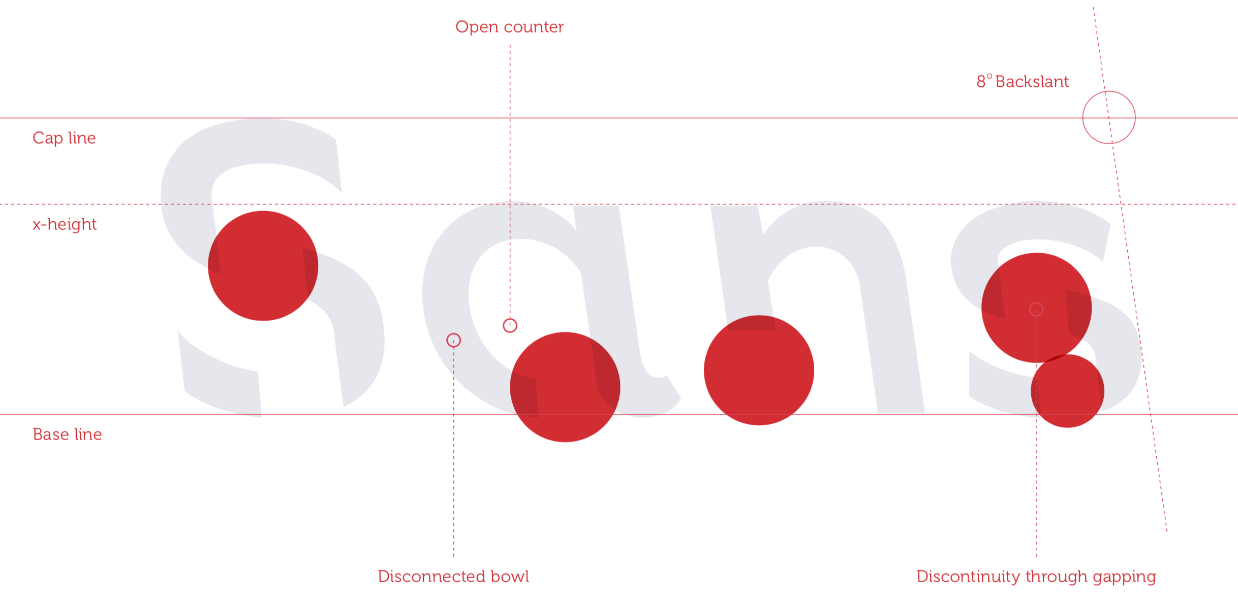
How to leverage Sans forgetica for student success?
The thoughtful use of Sans forgetica can be an additional tool in your toolkit when it comes to answering the inevitable question around midterms: what can I do to prepare for the exam? It is a neat, hip and easy thing to offer to students, but offer it with some guidance.  Tell them to…
1. Use it sparingly.
Students should reserve the use of Sans forgetica for key passages or definitions only. RMIT offers a Chrome extension that can transfer entire webpages to Sans forgetica, but for exam prep, that is not the wisest thing to do. If an entire chapter or article is transformed to Sans forgetica, our brains (the clever things they are) get acclimated to it after a while, and we lose the benefit of desirable difficulty – our transformed text will read like a normal text. Therefore, they should use Sans forgetica much like flashcards: transform only the most important, most difficult concepts to this font only.
2. Use it only once they have understood the concept they want to memorize.
Sans forgetica was designed to aid memory, not comprehension. When a learner is faced with an unfamiliar concept, the first goal is for them to understand what the concept means, which is a different cognitive process than memorization. Meeting a completely new concept in a difficult font can easily lead to cognitive overload, and result in neither comprehension nor learning.
3. Do not expect Sans forgetica to perform a miracle.
The RMIT team’s research subjects have demonstrated a 7% increase in recall when using Sans forgetica over Arial, an increase from 50% to 57% (Wu 2018). This, while significant, is telling: even with the special font, many were not successful recalling the information they read, or not all of it, anyway. Good study habits are quintessential to success: self-testing and retesting (Karpicke 2012), learning organizers (Luiten et al. 1980), good time management and adequate sleep (Gais et al. 2006) are likely much more important than the wunderfont. Reading and re-reading, however popular, is an ineffective study strategy, even in Sans forgetica.
Takeaway
Sans forgetica is an easy and exciting new tool to offer to students that will at least show that you care about their learning, and ideally, help them learn 7% better, on average. But if you remember anything from this article, make it this:

References
Bjork, R.A. (1994). “Institutional Impediments to Effective Training”. Learning, remembering, believing: Enhancing human performance
Gais, S., Lucas, B., & Born, J. (2006). Sleep after learning aids memory recall. Learning & Memory, 13(3), 259-262.
Karpicke, J. D. (2012). Retrieval-based learning: Active retrieval promotes meaningful learning. Current Directions in Psychological Science, 21(3), 157-163.
Luiten, J., Ames, W., & Ackerson, G. (1980). A meta-analysis of the effects of advance organizers on learning and retention. American Educational Research Journal, 17(2), 211-218.
Paas, F., Renkl, A., & Sweller, J. (2003). Cognitive load theory and instructional design: Recent developments. Educational psychologist, 38(1), 1-4.
Wu, K. J. (2018, October 8). Sans Forgetica is the Typeface You Won’t Forget. Smithsonian Magazine. Retrieved from https://www.smithsonianmag.com/smart-news/sans-forgetica-trippy-new-typeface-could-help-readers-remember-what-they-read-180970485/
https://sansforgetica.rmit
https://en.wikipedia.org/wiki/Typography